http://www.youtube.com/watch?v=KQdUe91cYr8&list=PLkjS3XTU7LdY3Lb-QG35eN_Gwp7UAVjLQ
http://www.youtube.com/watch?v=TUWi9ytJhDc
http://www.youtube.com/watch?v=f8fUFmjqXZo
These are sound effects I thought would be good to use in m trailer, as I currently don't have an and it's not as frightening as it would be with the sound effects.
These are just a few I found on youtube, I have some really good zombie ones on m memory stick, that I ma actually decide to include in my trailer.
I did a lot of research on sound effects and where and where not to add them in, whilst making a trailer and the thing I got from the research I did was not to add too much in, otherwise it won't look very professional and won't turn out to be a successful trailer. This is a very important fact that I need to keep in mind at all times, whilst adding in the sound effects.
Wednesday, 22 January 2014
Existing horror trailer soundtracks
Evil Dead - www.youtube.com/watch?v=tBN4KCSa1rE I really like this soundtrack and may include a bit of it in my trailer, as I really do feel it will fit in with m trailer, creating a intense atmosphere.
Insidious 2 - Tip Toe (Through the tulips) -Tiny Tim - I'm not going to use this, but I really think it would make a good soundtrack for m trailer, and does fit in with my theme.
Dead Silence - http://www.youtube.com/watch?v=hio1fHy_3HM - I really like this. It sounds really frightening and it is one of those sounds that would make you want to hear the rest, whether the content is too scar or not.
Sinister - http://www.youtube.com/watch?v=s4DayGTThsk -I also like this soundtrack, it really created that important intense vibe that put just can't get enough of. This would be a really good effect to have in my trailer.
Ancillary task 2 - Movie poster

This is my final movie poster for my horror movie 'Invasion'. I have again, stuck to the three main colours of red, white and black, to coordinate with the DVD cover. I have decided to go with only one picture this time, to keep it looking simple but effective. I think, doing this has really does have a positive effect to my viewers, as it's not giving too much away, however, it's giving a gist of what is included in the movie.
Overall I am quite happy with what I have produced, as it has a lot of the conventions of existing posters, however it also has many features that challenge conventions, which I feel have worked well and positively to my advantage.
Movie poster - Developed

I have made a few changes on the poster. To make it look better and give off a more professional vibe, I added names of the stars on top, as whilst researching, I saw that a lot of the movie posters had the same thing, that's one of the changs I have made. Anover development I have made to the poster is that I put the rating of the movie on, as, againg, I noticed that they did this in many of the ones that I have reserched, so decided to stick to conventions and added it myself. I added the date of release and the name of the 'company' releasing the movie and for effect, I added 'blood' on the bottom corner of the page.
Movie poster - final idea

I decided on this picture for my movie poster.This picture gives off a personal vibe, as the zombie is looking directly at the camera, making it more frightning, invighting the audience in. This is frightening and perfectly fits my genre of movie, as the contrast is so low, making the picture dark and scary. By the contrast being so low, it allows the attention from the audience to be drawn to the lighter coloured eye. The zombie, in this photo, has no expression in its face, it is just staring blancly at the camera, creating a frightning vibe.
Movie posters ideas
For my movie poster, I decided to play around with a few of the photos I have of the zombie. My idea is to have one big picture of the zombie looking at the camera, to adress my audience and then, sticking to my colour scheme of red, white and black, have the title in big bold 'grunge' letters, as I feel that will be perfect for my horror genre. I want to have the small font writing, telling you who is in the movie, who produced it, ect. Also another thing I want is the stars names at the top, just like most of the other movie posters I have researched. Having this, I feel will make my poster look more real and look professional.


Friday, 17 January 2014
Ancillary task 1 - DVD case

I added the four pictures on the back cover because, before I actually made this case, I asked a few people what gets their attention in DVD covers, and most of their answers were pictures of what goes on in the movie. Knowing this I really took this to my advantage, and added a picture of the creature in very low contrast on the back, making the case look more appealing to my audience.
To stick to conventions I added all the features included in the DVD, which include: deleted scenes and interviews. This, again will attract my audience as there are extras included in this movie. Another convention I stuck to was adding the rating of the movie and copyright warnings. This really creates a professional look for my case. I decided to put them, and the barcode in boxes, which is how I put my own spin to it as when I looked at existing cases, the writing was all structured in columns, so I decided to challenge that convention, which I think really paid off, as it created more of a scary look, which is exactly what I want.
 Another convention I stuck to was the font and type of writing in the credits I noticed that, on existing covers they have credits that is difficult to read, as they use very narrow writing, which is exactly what I have done and I feel it has made the back cover look better.
As most DVD covers are sponsored by companies, e.g. Warner Brothers, Universal, Fox, etc, I made a company logo for my company 'Take four film studios' and thought it will give a good effect to my case if I added it on. I, again stuck with the three main colours of: red, white and black, and tried to make it look appealing and good for releasing horror movies.
The spine of the DVD cover, I added the ratings, as well as the company logo, again, which gave it a more effective and real look. I also added the title, like on all of the existing DVD cases I have looked at. I used a 'Grunge' font, as I felt this font was the most appropriate for my genre of film and really fitted in with the case. Another thing I added on the spine was a low contrasted picture of the creatures eye. This gives the case that edge and makes it look more terrifying to my audience, making them want to buy the DVD.
On my front cover I used two taglines. 'What was once trapped is now unleashed...' and 'The lucky ones die first...'. These taglines creates a huge impact, as most taglines are made to hook the audience, and I feel that mine do exactly that as they create a curiosity on how powerful this creature is, how he was trapped before , what unleashed it and the curiosity if anyone will survive.
I added the rating of the movie - 5 stars in the middle of the front cover, to catch the eye of my audience, telling them how good this movie is, increasing their interests of watching the film. An effect I added on top of the stars, was some scratch marks, making my case look that even more horrifying.
The title, I decided to put at the bottom of the case in big, red, 'grunge' font, capturing my audience's eye and making the movie more like a horror, one that it too scary to watch on your own.
The nine picture I added on the front cover, tells my audience what the movie is about, summing it up in a few pictures, really capturing their interests by showing photos of horrific cuts, scenes of what happens in the movie, horrified students and the creature itself.
All in all I am happy with my final version of my DVD case, as I feel it looks professional and when I compare it to an existing case, it does actually look just as good and has it's similarities as well as differences.
Final back cover - DVD case

This is my final back cover for my DVD case. I decided to change it a bit, to make it look more professional and more like a DVD case, by moving the ratings and small print to the bottom of the case, just like they do on existing DVD back covers. I stuck with three main colours, which I noticed they do on existing covers. My three colours are, red, white and black. These colours are perfect for my genre, horror, as they imply death, blood, danger, etc.
Final front cover - DVD case

This is my final front cover of my DVD case for my horror movie 'INVASION'. My front cover includes pictures of the content in my trailer. It shows the 'creature', but not the full face. It also includes pictures, some of which you don't see in the trailer. I added the pictures of the 'wounds' I made out of liquid latex, fake blood and paint, to insinuate gore and violence in the film, which I feel will get my audience more hooked and would want to watch it.
Updated DVD back cover

This is my developed back case of the DVD. I stuck to conventions of existing cases and added a lot of the features and content that the existing covers had on. (rating, barcode, font, copyright, extras, etc.)
Tuesday, 14 January 2014
DVD back cover
I have made even more progress with the back of my DVD case. It is now looking more professional, as I have added in features you would see in existing DVD covers. So far I am happy with what I have created, although I feel that I need to work on it more to make it look even better and more like a DVD case.


Fonts
I am currently adding some final touches to my DVD case, front and back, and now have to find the right fonts to use. I've experimented with most of the 'Handwriting' fonts, but decided they didn't fit with the horror theme, so I've decided to use 'GRUNGE' fonts. However, I looked at existing horror DVD cases and saw they actually used 'serif' and 'sans' font, I experimented with a few and have decided to use either, Franchise or 'Six Caps' as these two fonts fit nicely with the theme and also gives my DVD case more of a professional look.
Company logo
To make my DVD case and poster look even better and more professional, I decided to create a logo for my 'company', that I again made up, called 'Take 4 Film studios'. This is the logo I have come up with and really quickly created and edited on Pixlr. I will add this logo onto the back of the DVD case and will write a bit about the company on there too.


Dvd back case - progressed

I have added more to the back cover of my DVD case. I have decided to stick to conventions and added the same style of writing, so that you can just make out what it says. This is the style I've seen on most of the DVD cases I have seen. I have also used the 'DVD - Video' symbol, as again it was on most of the cases I have seen.
DVD case back cover - drafts
These are my first drafts of the back of my DVD case, I decided to add a few pictures of what is included in the film, to give my audience a feel of what the movie is about and to make them want to watch it. I've gone with the colour red to coordinate with the front cover case, because the two main colours are red and black. These two colours are perfect for a horror movie case, as the connotations are danger, death, fire, anger and power, which is everything I'm trying to include in my trailer.


Monday, 13 January 2014
DVD cover - First draft

Looking at existing movie posters
Just like the DVD case, I did a lot of research on movie posters, looking as as many existing ones as I could and take inspiration from it, it make my own. Again, I looked at the conventions to make the poster successful and this is what I found noticed were the conventions of most of the posters I looked at:
- One main image
- Actors names
- Use of the colour red
- Taglines
- Quotes
- Bright colours used
- Dark setting
In the creation of my movie poster, I will have all of these conventions in mind, as I know that these are the conventions that will give my poster a more successful and professional look to it, which is important and exactly what I am aiming for.
I have had a few ideas for my poster, by looking at existing posters it has given me inspiration to make one looking like the ones I've viewed (see further post to see these). I definitely want to only have one image in the middle and to add a personal touch to it I want my zombie looking directly at the camera, so it is literally drawing the audience in to watch the film.
Looking at existing DVD cases
I have searched and have done a lot of research on existing DVD cases. There are obvious conventions that you need to include in the making of a case, this includes:
- A rating
- Pictures
- A summary of the film on the back
- A barcode
- Copyright warnings
- spine
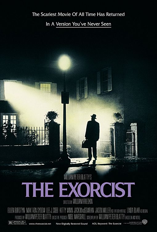
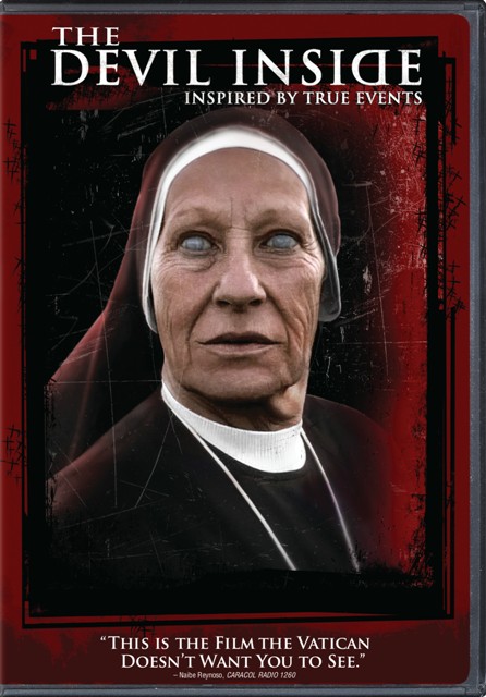
The cases I looked research, which include Friday the 13th, the devil inside, paranormal activity, etc. I noticed all had one main picture on the front of the killer and then taglines and quotes form the film written on it.
When I come to create my case, I am going to take all of the conventions to account and add as many in to make the case look professional and successful.
The software I decided to use to create my case is Pixlr. This is because I am familiar with the use of it and I feel I will get the best outcome using this website, also the fact that this was what I used all throughout my AS coursework, so I feel rather confident using it.
DVD Case idea
For my first Ancillary task, I am creating a DVD case. I've had an idea of creating a collage of all the different pictures, some included in the trailer and some not, as the base of the case and then on top of the collage, I am thinking to add the zombie, in very low contras, so you can only just see it.
Ancillary tasks
With my main task of creating a horror movie trailer, I have two ancillary tasks to complete. The first one is to create a DVD cover and the second is to create a DVD poster.
To help me do this, I have looked at existing ones and have brainstormed ideas from them, to put in my own. These are the ones that I have looked at and taken a few ideas from - DVD cases:


To help me do this, I have looked at existing ones and have brainstormed ideas from them, to put in my own. These are the ones that I have looked at and taken a few ideas from - DVD cases:

Movie posters


Sunday, 12 January 2014
Target audience

Prior to my horror movie trailer production I had to establish my main target audience, so I was able to work with this to an advantage. A target audience is the primary group of people that your products are aimed at. For example; it can consist of targeting people of a certain age group, gender, race, etc. Before the making of my trailer I decided that I wanted my trailer to be for the audience, aged 15+, as I have certified it as an 15+ certificate. As horror films often contain scene with lots of gore and murder they are not suitable for those of under the age of 15, depending on how strong the violence and explicit the images were. As my film would contain lots of gore and murders I decided that I would classify my film as being an 15.
Thursday, 9 January 2014
Sound and music
I am currently going through a lot of horror movie tarilers and analysing the soundtracks and the background noises, trying to get more of an idea of what sounds to add in and how long for and whether or not to have a sound bridge, through one of my scenes and the credits.
So far, I have added in a zombie roar, that fits in with the scene of the creature attacking a school girl. I have also added in dramatic music for the end scene, where the zombie makes eye contact with the camera.
I am going to make a list of all the soundtracks from existing horror trailers and will experiment them with my trailer and will decide which, out of them I will use.
Idea changed
I have decided to change make a few changes to my trailer, as before the scenes were too long and to stick to conventions, I need some quick pace scenes. So I have cut down a lot of the scenes, making them five seconds at the most, which creates more of a thrilling atmosphere, which is perfect for a horror.I have looked at even more existing horror movive trailers and saw that most of them don't show the attacker until around half a minute in. I decided to challenge the conventions slightly and added a one second glimps of the zombie, to get my audience more hooked in and wonger what it was they have just seen.
Subscribe to:
Comments (Atom)